
Farringdon Chambers / Five new website directions
One chambers.
Five perspectives.
Explore the homepage, complete directory, individual profile and news in each direction. Every concept has deliberately composed desktop and mobile layouts.
Download all 25 presentation images ↓A specialist set, seen differently
Parallax
A panoramic photographic composition with a large typographic counterpoint. Deep green, sharp mint and a movable photographic viewpoint carry through broad professional rows and a composed profile spread.

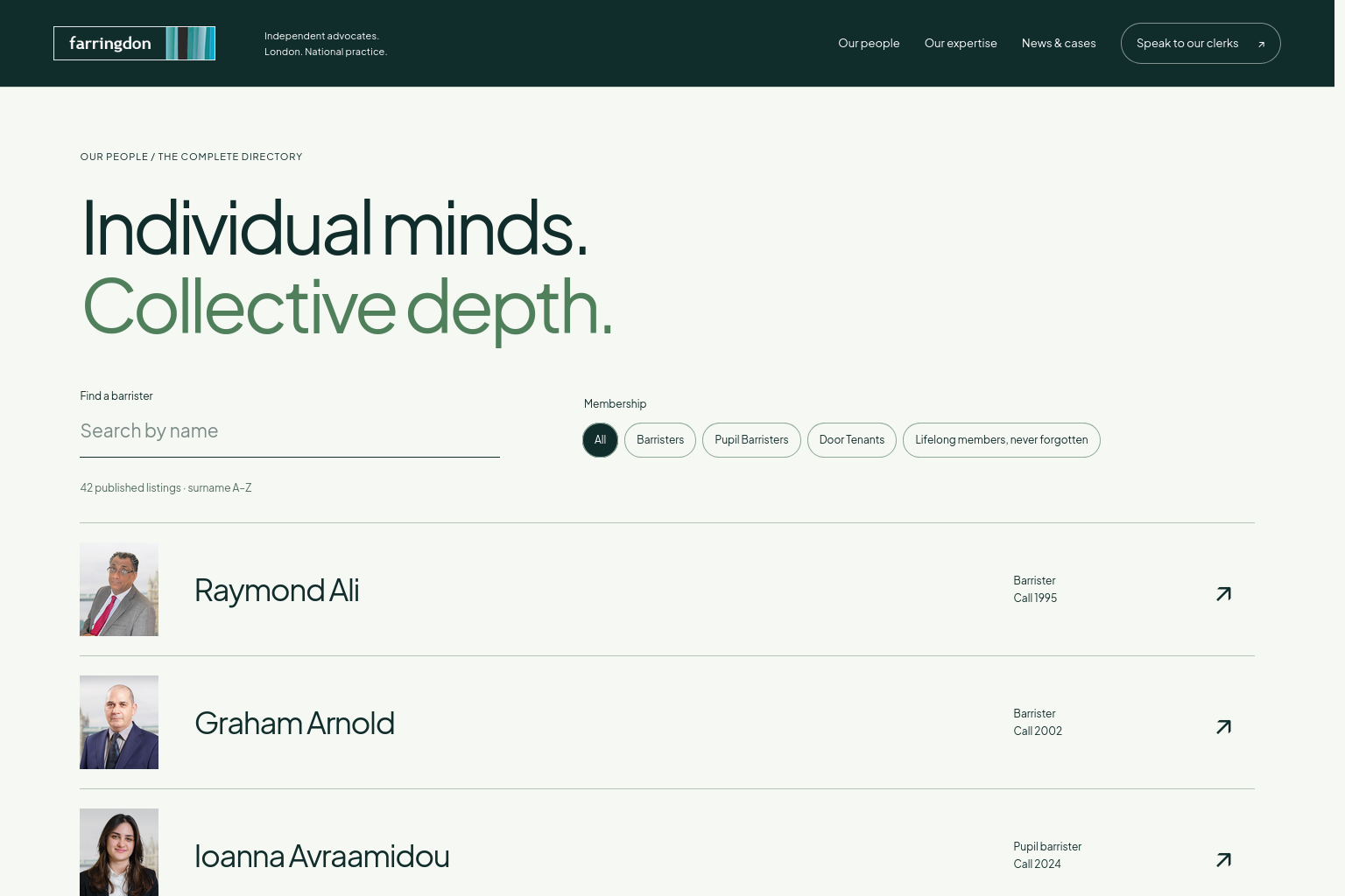


PeopleWide professional rows with a search field and membership chips
ProfilesA portrait and professional introduction share one editorial spread
A confident new shape for chambers
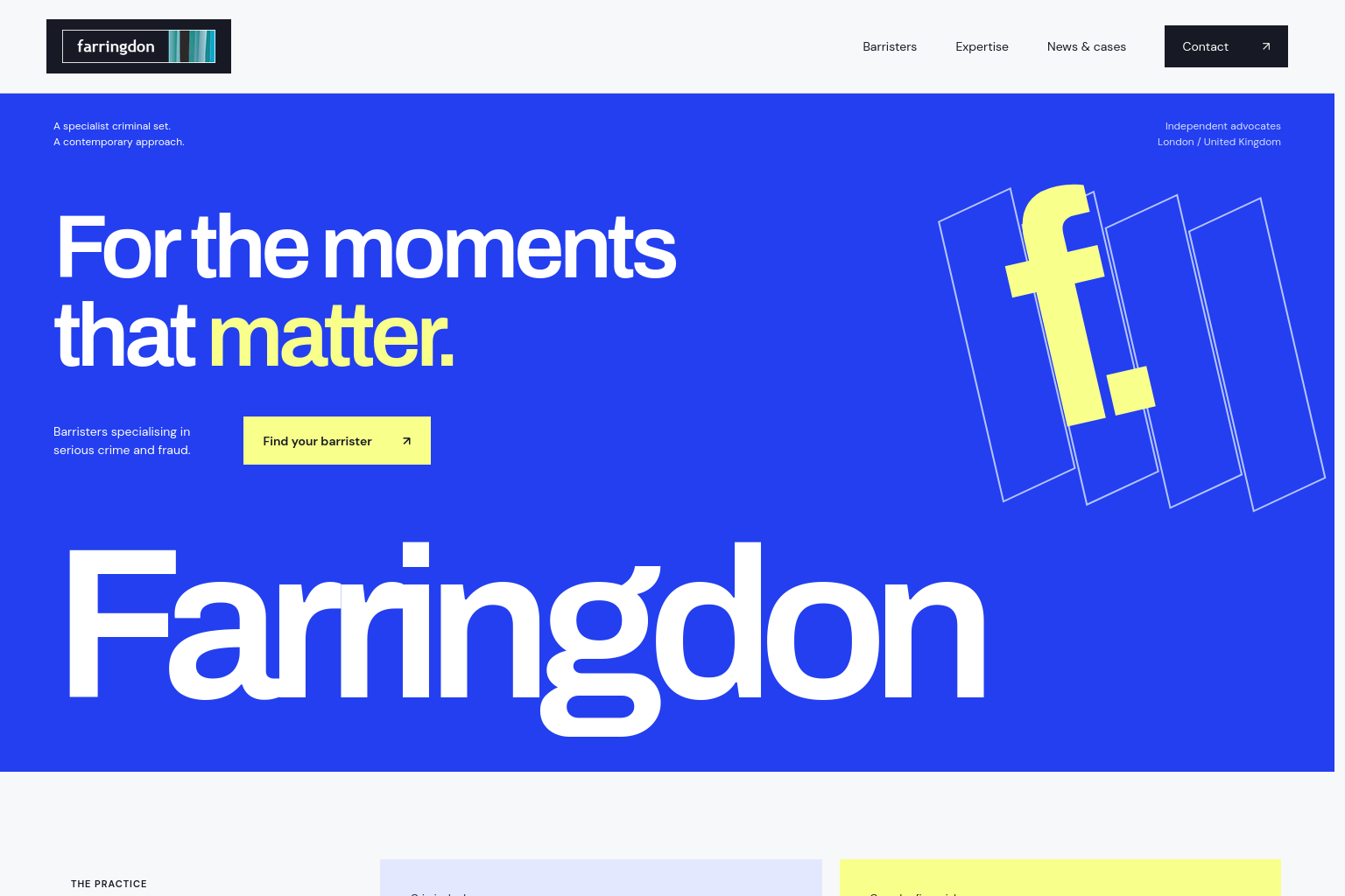
Forma
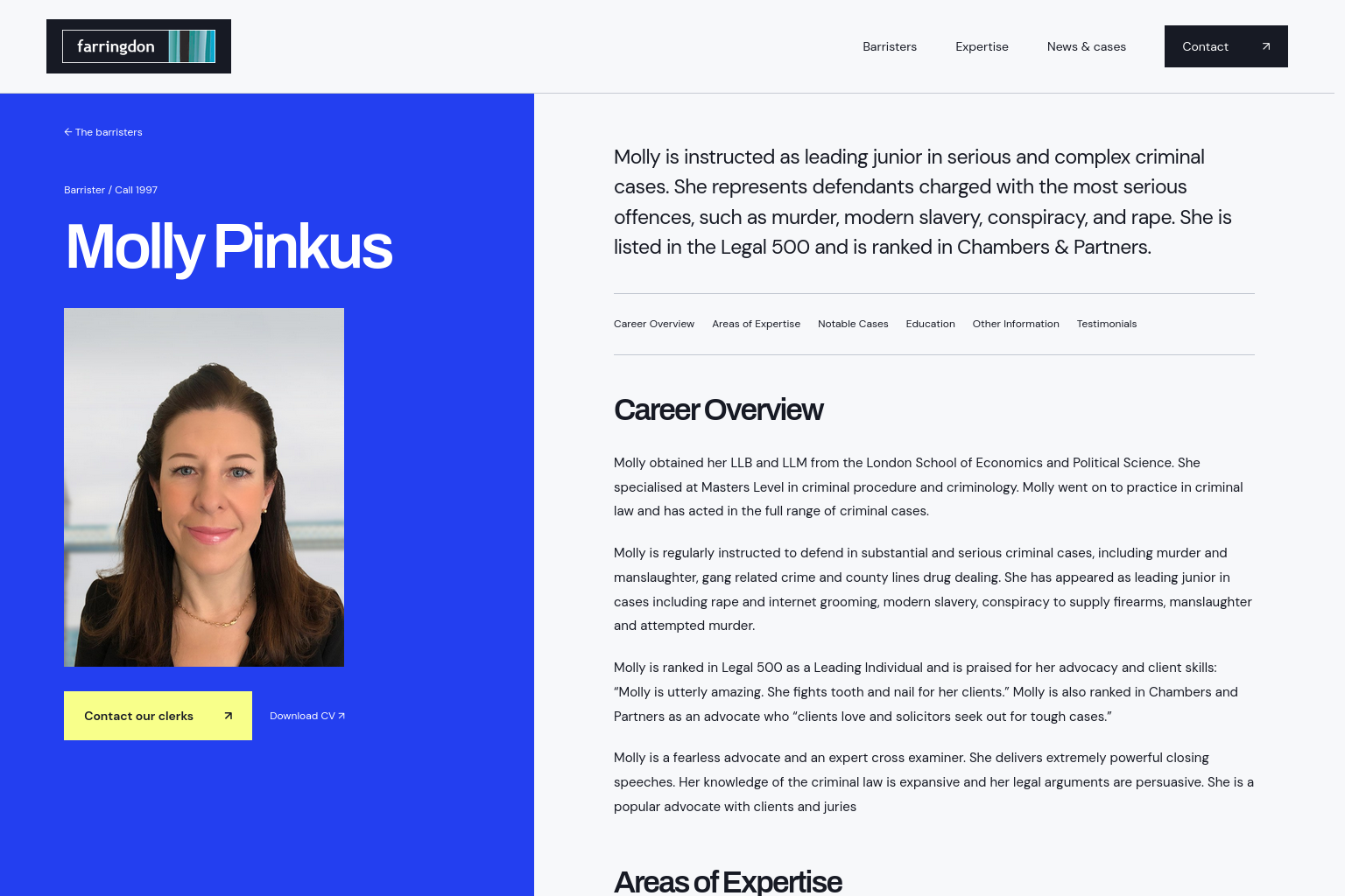
Electric blue, precise geometry and a large cropped chambers name create an assertive contemporary identity. A generous portrait directory and a full-height profile contrast with the graphic opening.
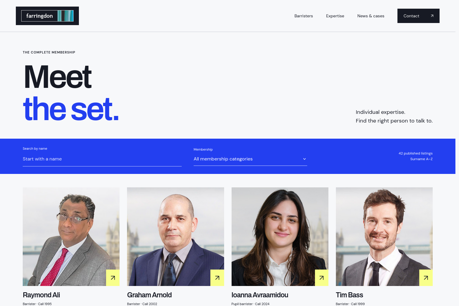
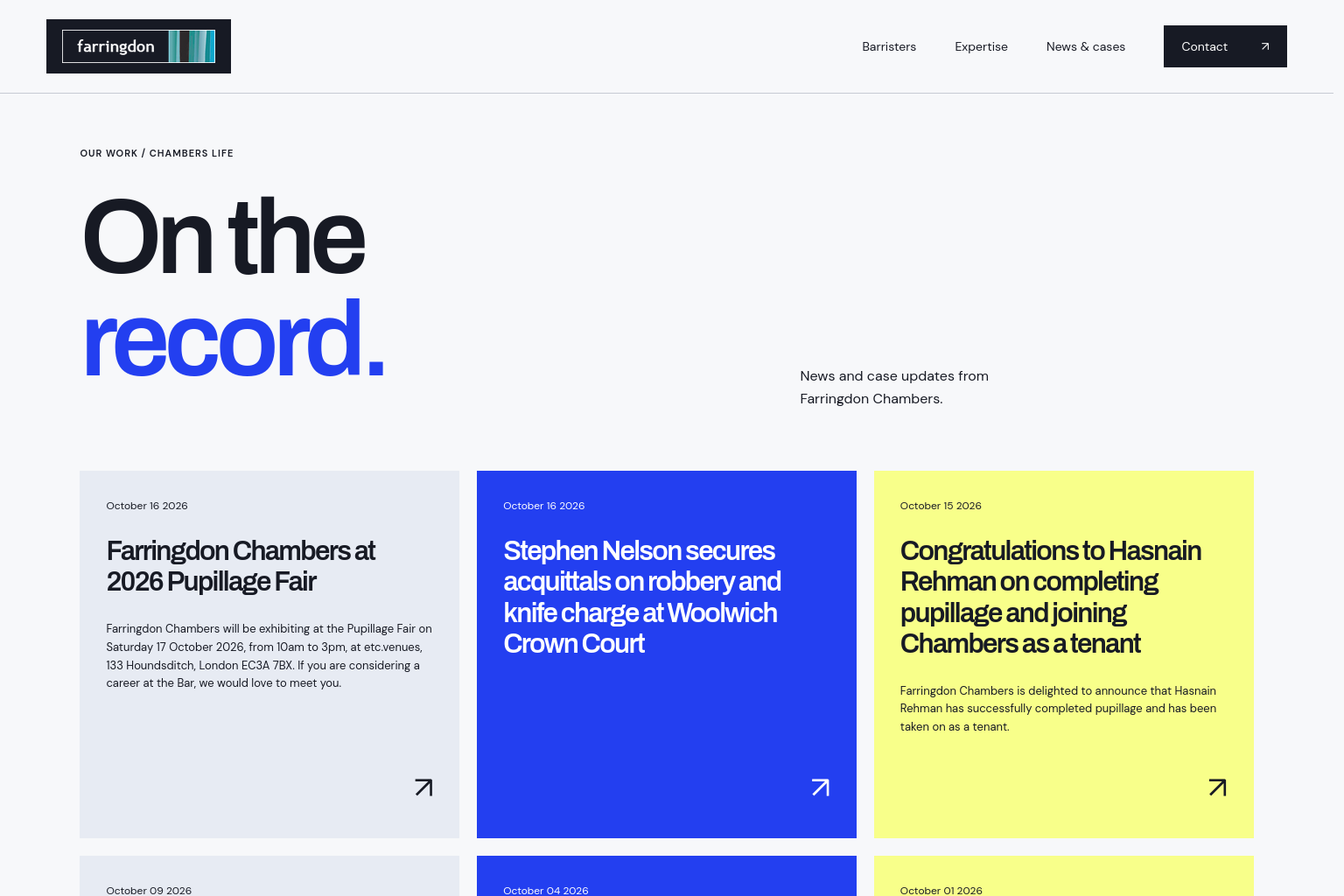
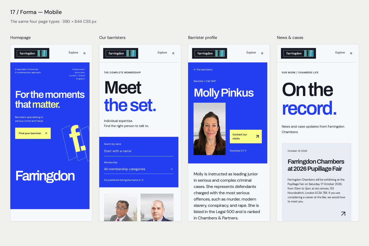
PeopleA spacious four-column portrait directory with an integrated filter band
ProfilesA blue identity column beside a carefully measured professional record
Individual advocates. One chambers.
Assembly
An expressive coral identity with open, rounded typography and a complete name composition. People are encountered through a typographic address book, while profiles pair an unaltered portrait with a distinctive personal introduction.
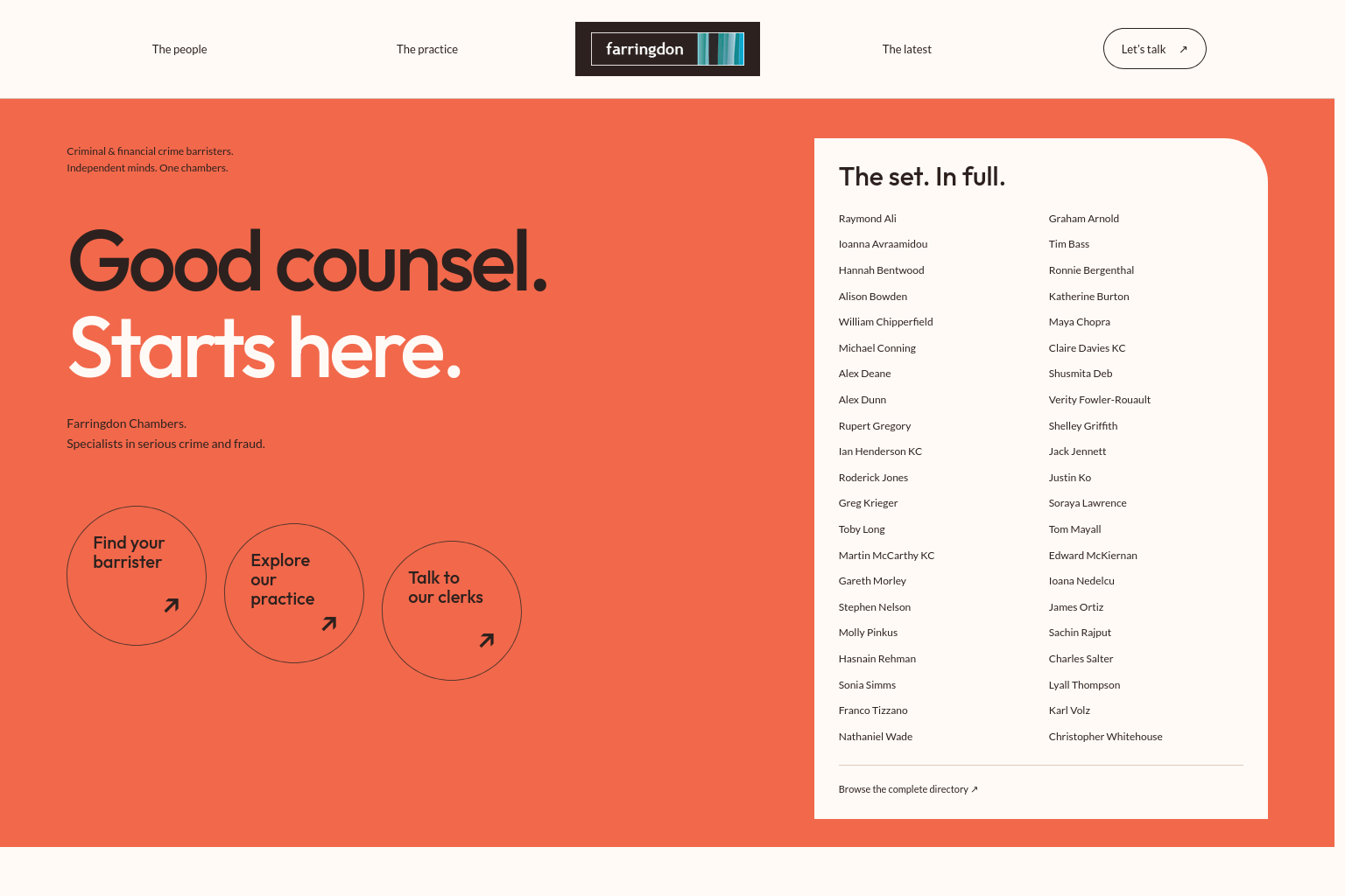
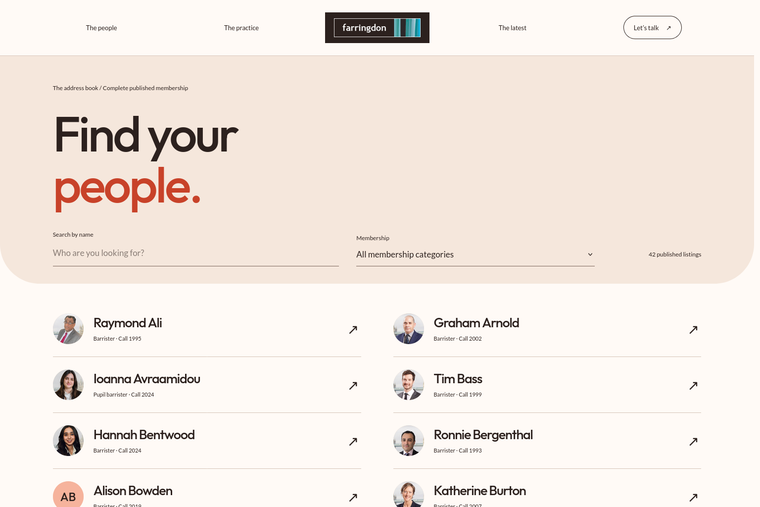
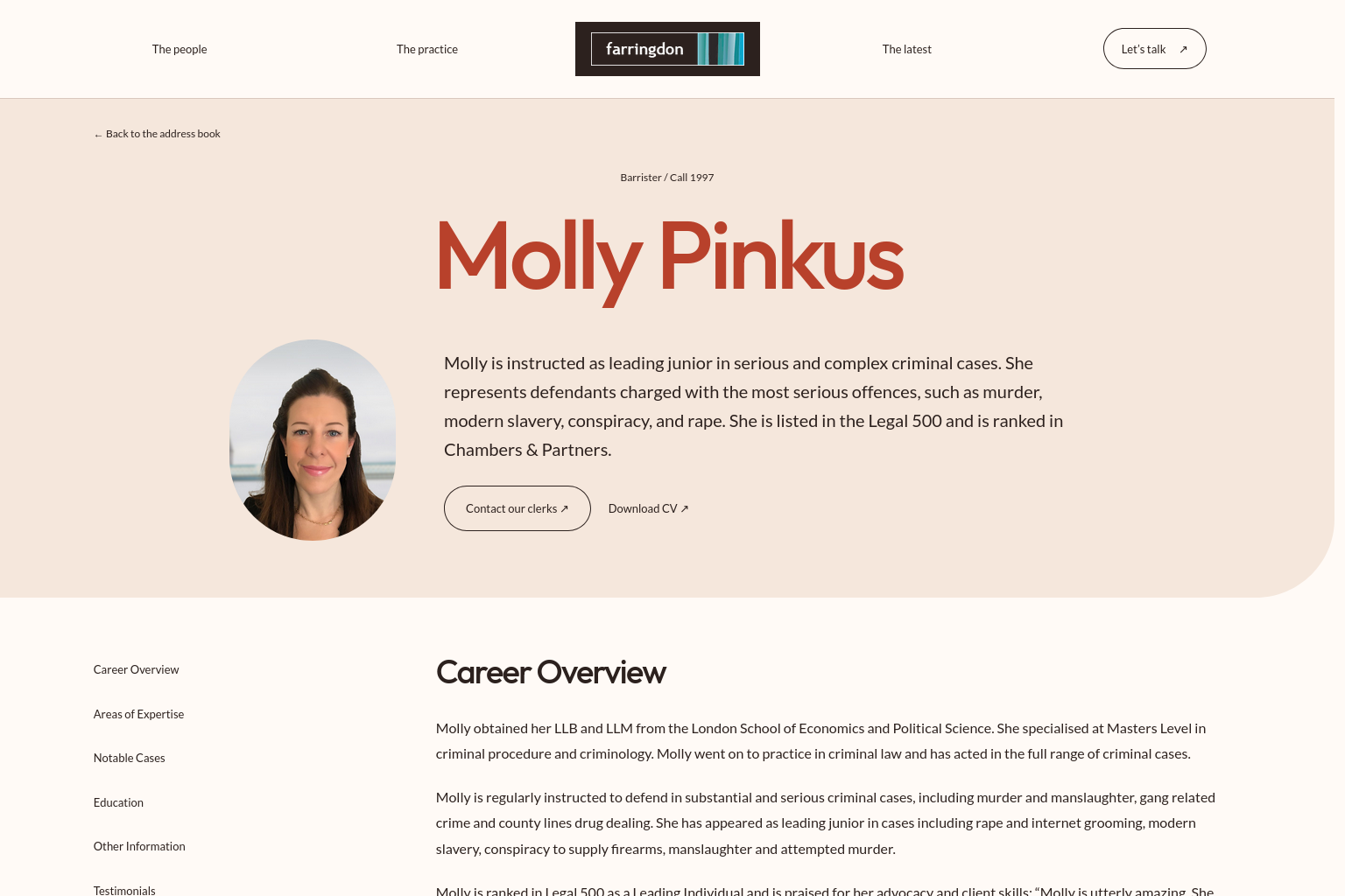
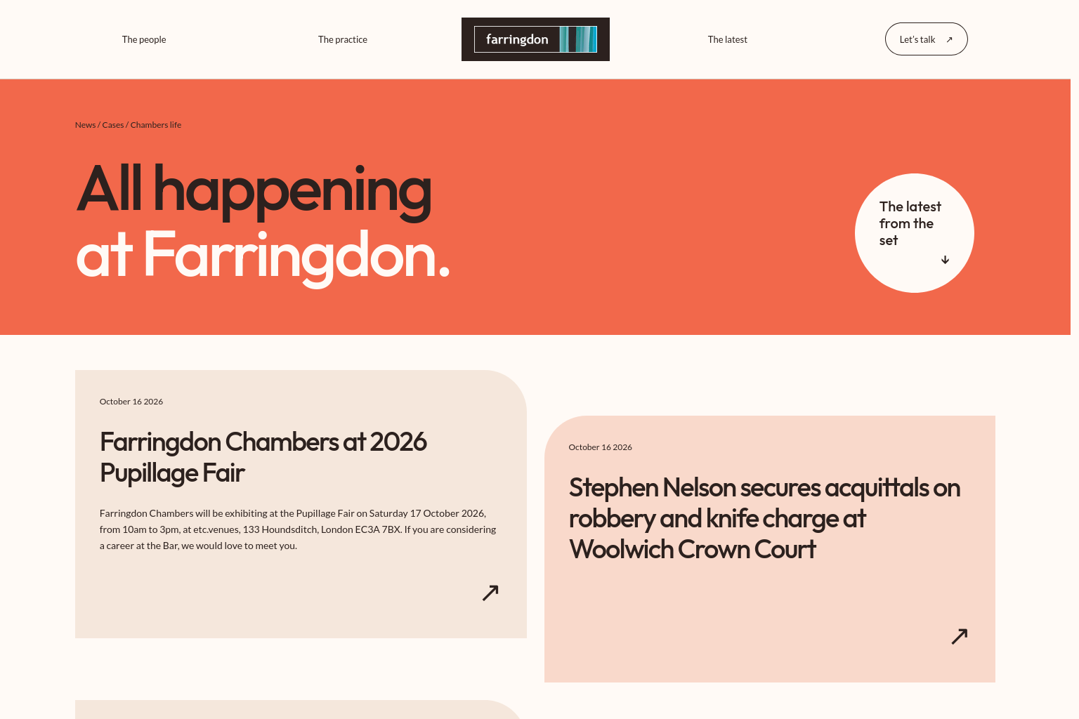
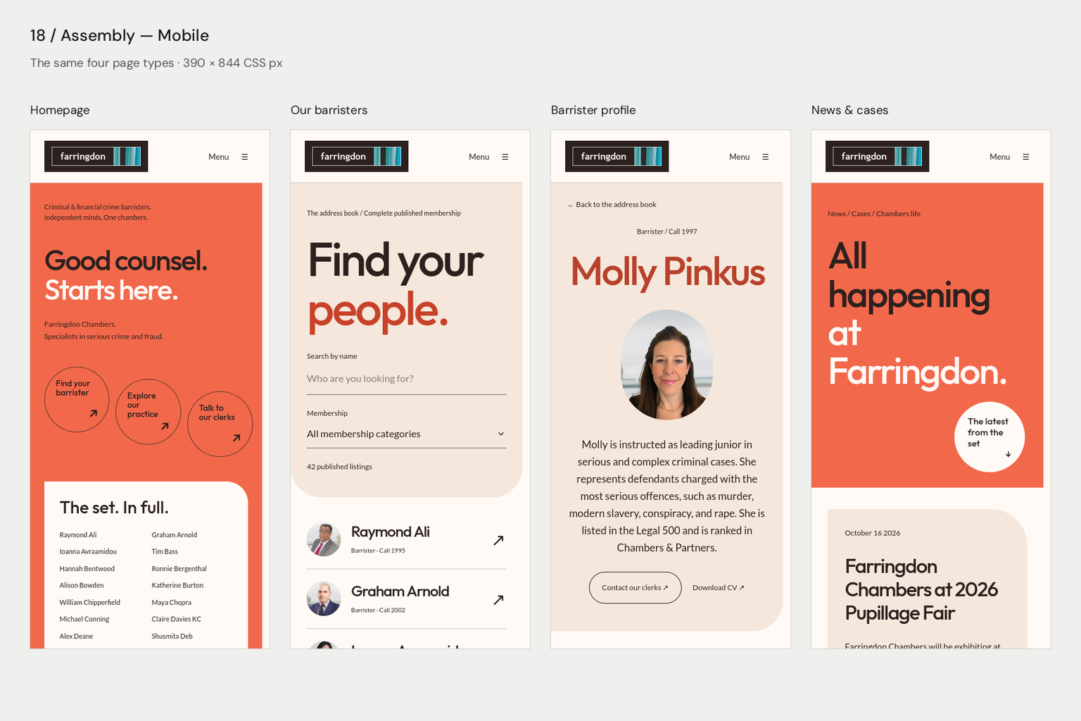
PeopleAn alphabetical address book with portraits revealed within each entry
ProfilesAn offset portrait and oversized surname followed by a readable biography
Clarity in a complex field
Locus
Lilac and aubergine frame an original perspective drawing. An immediately useful practice selector sits in the composition. The directory uses a split canvas; profiles have a concise identity panel and sectional reading controls.
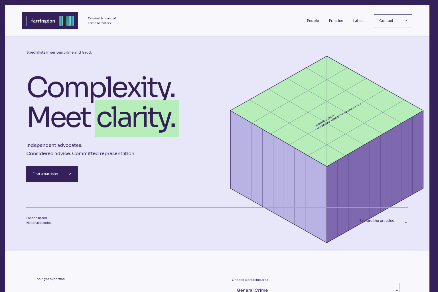
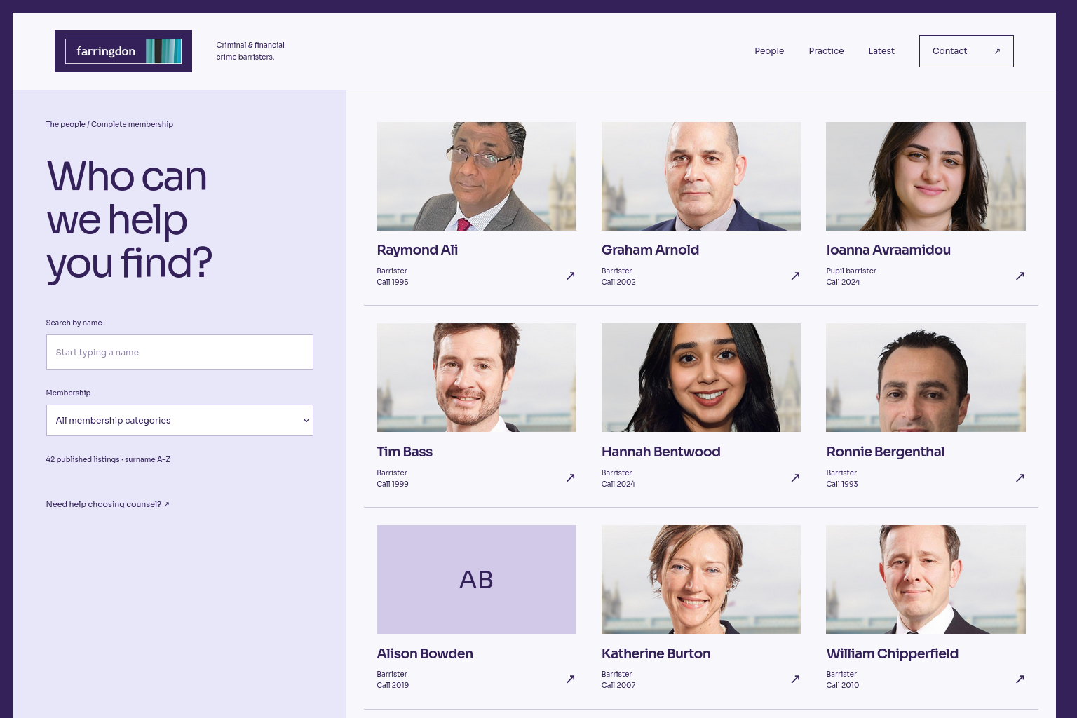
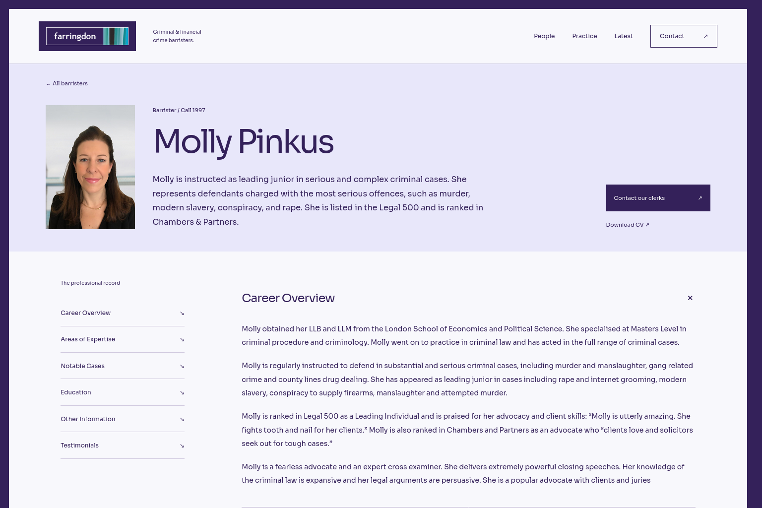

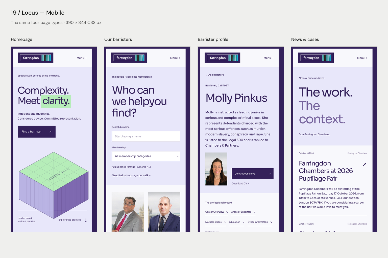
PeopleA continuous membership field beside a clear search panel
ProfilesA compact professional identity with a sectional biography reader
A clear position
Outline
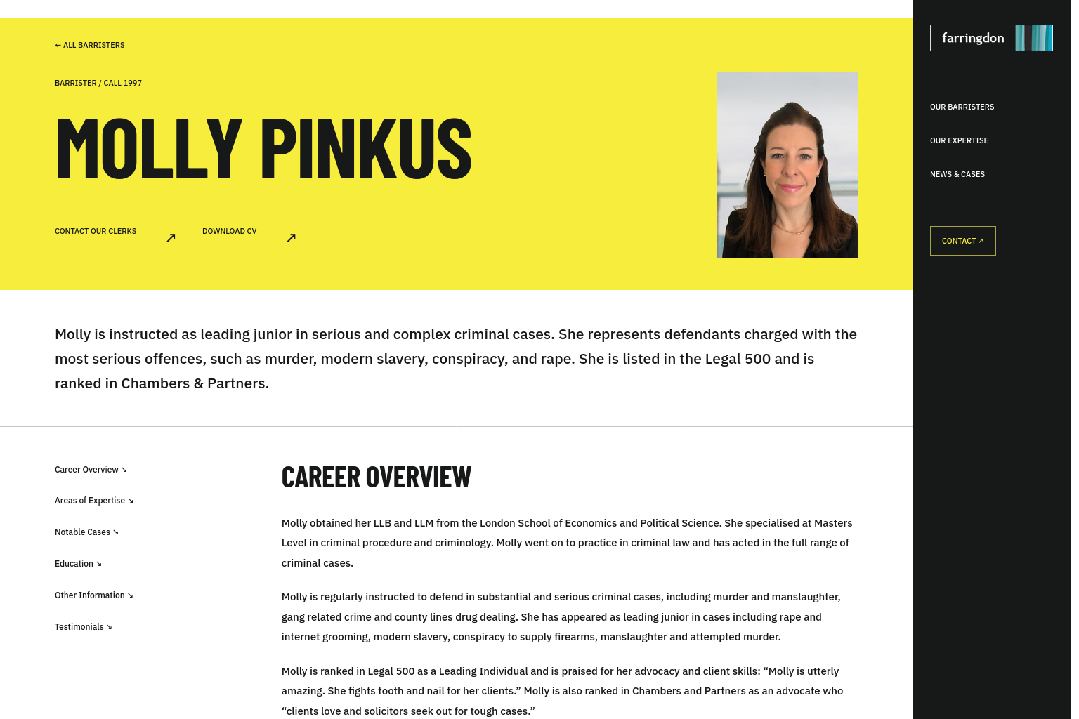
A yellow-and-black typographic identity with a tall, deliberately compressed opening and an original line drawing. A compact professional roster, horizontal profile and chronological news layout sustain the same direct character.

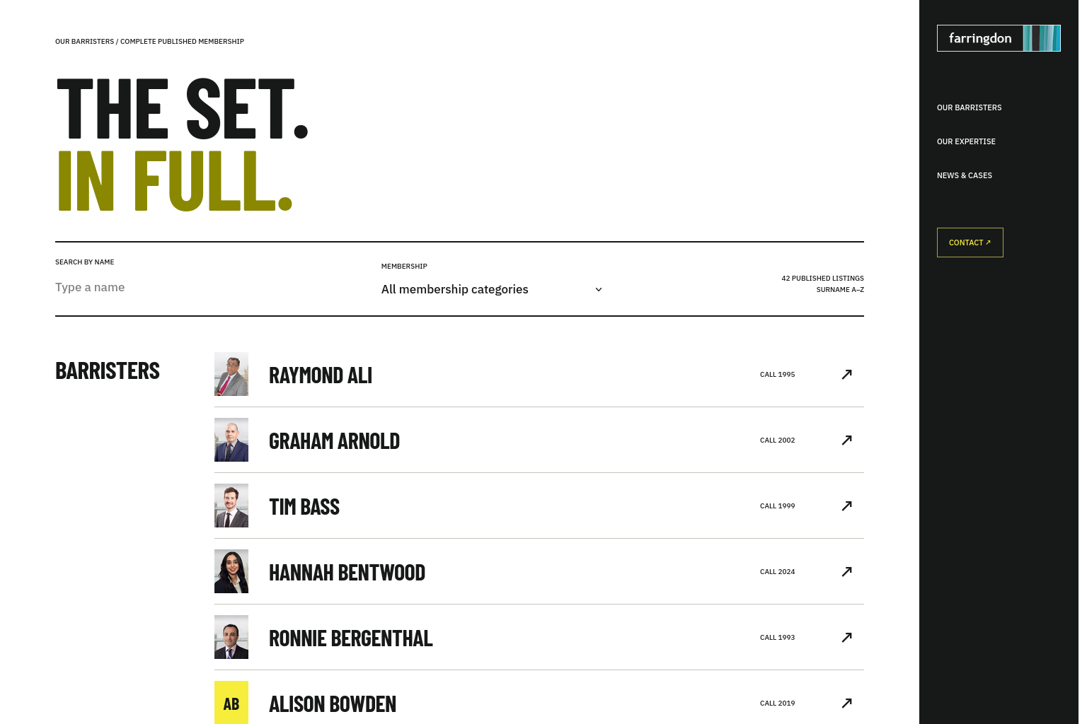


PeopleA precise professional roster grouped by the source membership categories
ProfilesA horizontal identity band, smaller portrait and a full-width reading layout
The comparison
All five use the same published membership and professional content. Creative headlines are proposals. Molly Pinkus’s original photograph is used directly in every profile.
These are design concepts for review. The previous fifteen remain available. The presentation retains noindex, nofollow.
Explore the previous concepts ↗